Before
-
-
-
-
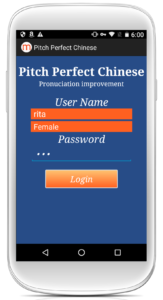
- Non-standard, inconsistent UI
- Unnecessary password field
- Complaints about design from users
-
-
-
After

-
-
-
-
- Used Standard iOS UI elements
- Removed password field
- Designed Logo and softened color scheme
-
-
-
Before

- Confusing Information Architecture
- Raw file names instead of titles
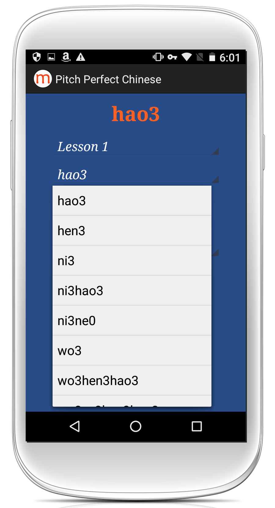
- Drop-down menus that cover other elements
After

- Intuitive hierarchy of information
- Icons instead of buttons
- Native iOS menu
Before

- Unnecessary alert with confusing count-up timer
- Buttons not proportionate for all screen sizes
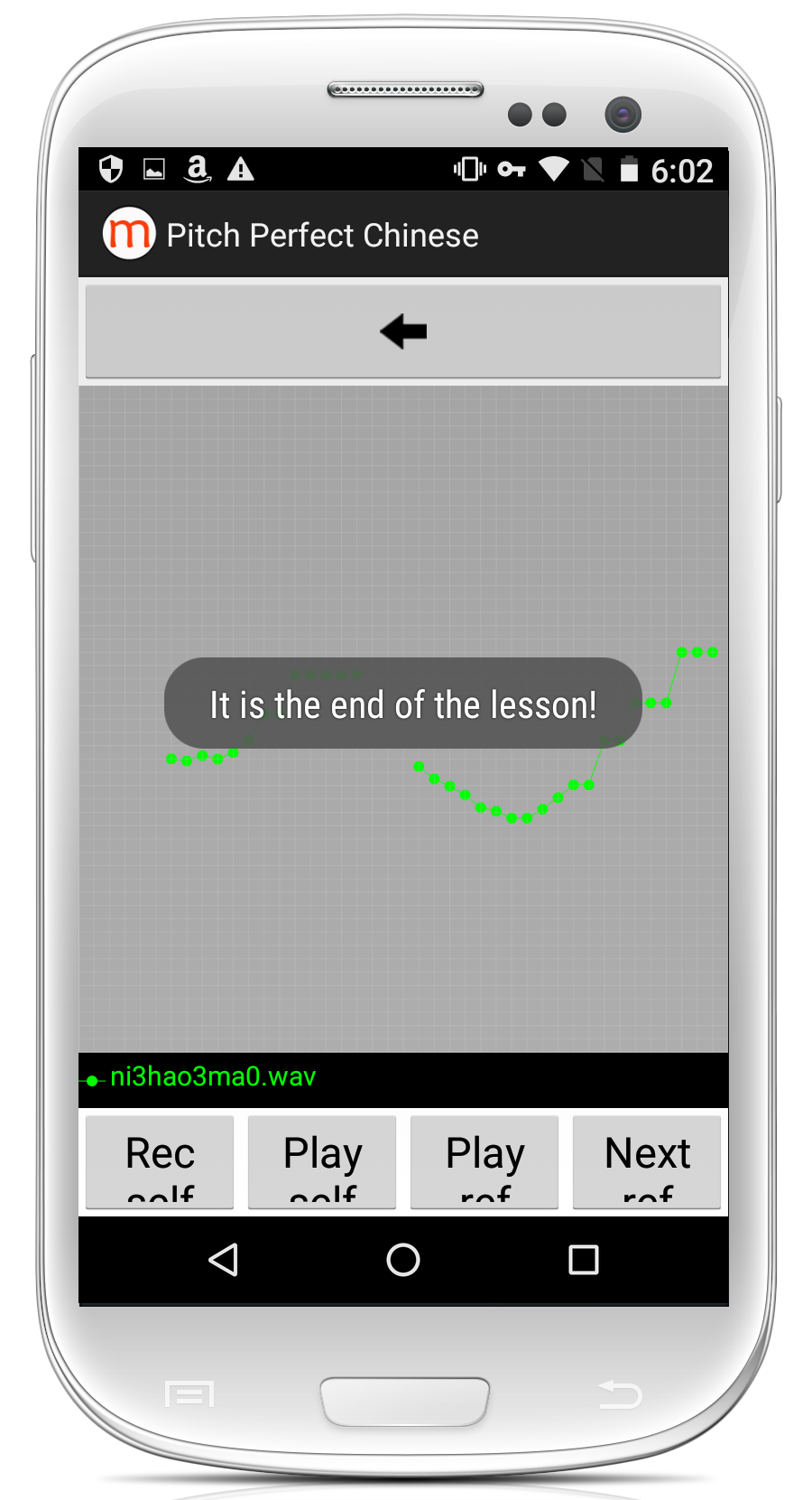
- Inconsistent alert UI
- inconsistent Color scheme
- File names instead of titles
After
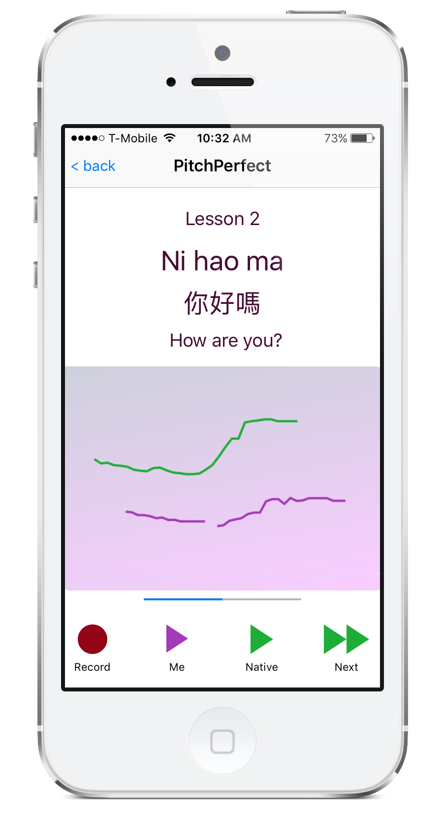
- Removed Alerts
- Replaced count-up timer with progress bar
- Replaced file names with titles using Chinese characters
Before

-
-
-
-
-
- Designed by programmer
-
-
-
-
After

-
-
-
-
-
- Refined by designer
-
-
-
-
Initial Wireframe and Logo Ideas
We presented the client with a (mostly) greyscale wireframe as we were primarily focussed on reworking the navigation. So, colors were only used for standard iOS UI elements and where needed, semiotically. We suggested that the male/female radio buttons be moved to the lesson screen so that users could choose which type of voice they wanted to hear at will. We also suggested that the circular record button should turn into a square while recording, rather than pop up an alert. Finally, we presented some initial logo ideas that combined a microphone and a tuning fork.
Color and Logo Choices

With the wireframe accepted, we presented a pastel color palette to lighten the app’s visual weight and some refined logo choices. We also proposed removing the login screen to make it easier for the user to begin using the app immediately.
Final Choices

Because the app was intended for research purposes in the classroom and not for general use, the login screen needed to stay and the male/female radio buttons would need to remain on the login page. However, the password field could be removed, thus eliminating the need for a password-reset screen.
Client: Professor Dorothy Chun, UCSB
Role: UX / UI Designer
Skills: Adobe Illustrator, Sketch, Xcode Adaptive Layout
Brief:
The client needed a redesign of an existing Android app for iOS. The app was meant for use in the classroom to help beginning Chinese language students practice their tones. The problem was that most students had iOS devices and those that did have Android complained about the design, which was cobbled together by the developer. In all fairness, they did a great first draft. But, In addition to the programmer art, the user experience suffered from confusing navigation and annoying alerts.
Solution:
With buy-in from the client to overhaul the information architecture and user experience as well as the visual elements of the design, we used Sketch and Illustrator to design the mockups and built the prototype directly in Xcode using adaptive layout so that the developer could use the prototype as the front end.